Co-Branded Collateral Workshop
Once you are ready to have the co-branded collateral workshop, here is what you can expect to cover:
- We will preview a sample PDF together. Please either have a sample PDF ready or send one to your Marketing Operations Manager ahead of time.
- Based on your sample PDF the Marketing Operations Manager will recommend where your logo and other contact information should go. We will use Zift's best practices to guide you on how to best customize your PDF. A few areas which will be covered are:
- Logo placement.
If you would like to place the logo over a section which has a colored background, please be aware that a partner may have a logo that could clash/blend into the background. It is recommended you use a white background for logos. - Transparent Logos are always best for co-branded collateral.
- When placing the contact information field, be aware that some partners might not have an American address and may need to provide extra space.
- Logo placement.
- Below are the key items (excluding any custom requests) that will need to be discussed before production can begin customizing collateral:
- Where will the partner logo be placed?
- Where will the contact information be placed?
- What information do you want the partner to be able to provide? (ex. Phone, email, address…)
- Is the partner able to edit any of the text on the PDF?
- Is there designated space for the partner to add a value proposition?
- Are there any default settings/text we need to put in the PDF fields? (ex: non-remembered fields, default contact info)
- Who will have access to this print media?
- Are there a few specific partners who will have access to this collateral or will this collateral be available for everyone?
 Preferred positioning
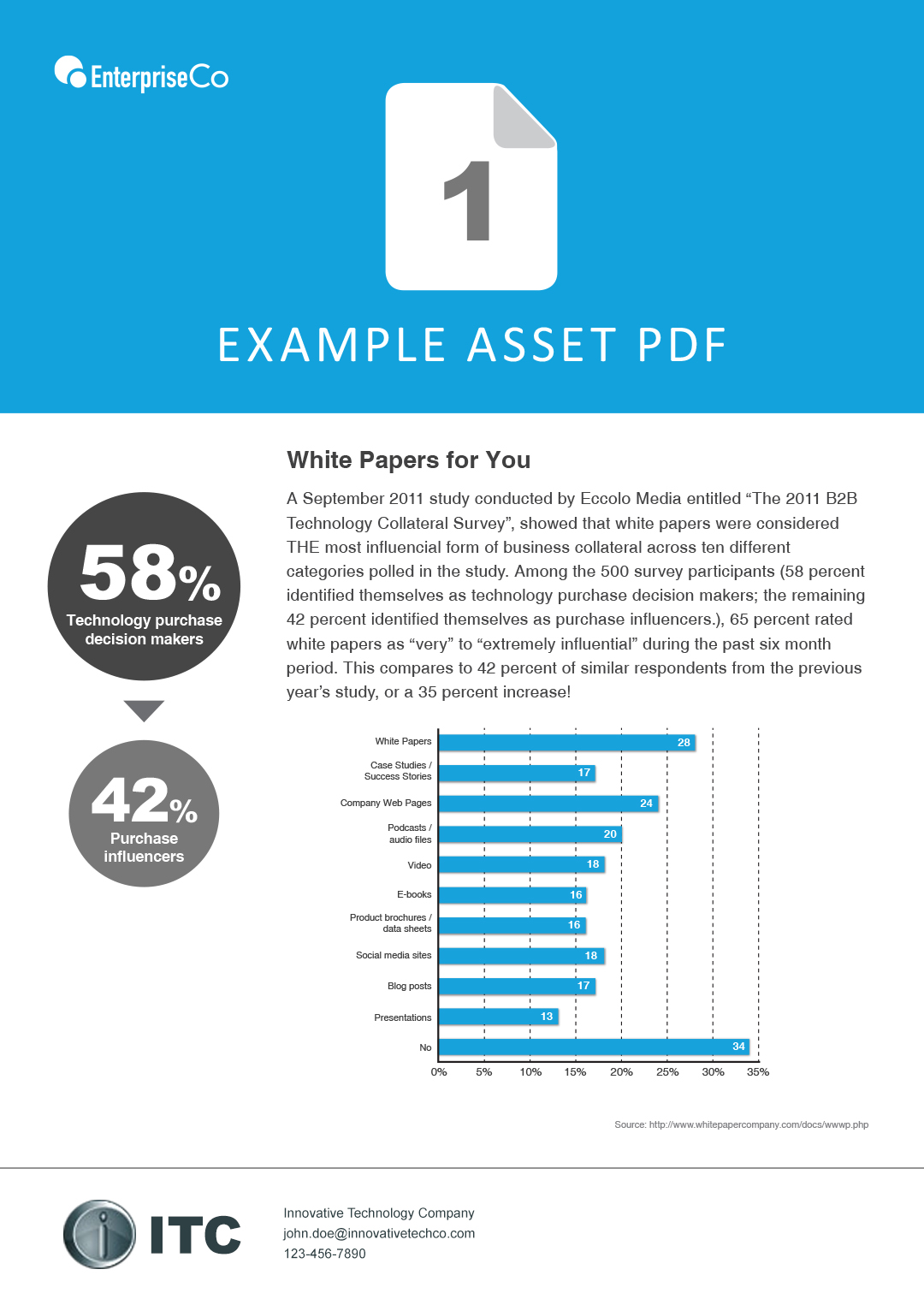
A long horizontal section is preferred to accomodate various lengths of names or email addresses. It is also typically a cleaner design, because it looks like the cobranded section was considered as part of the initial design when the layout was built (not just crammed into whitespace).

Here is an example of a longer email address that has proper room to expand to.

 Questionable positioning
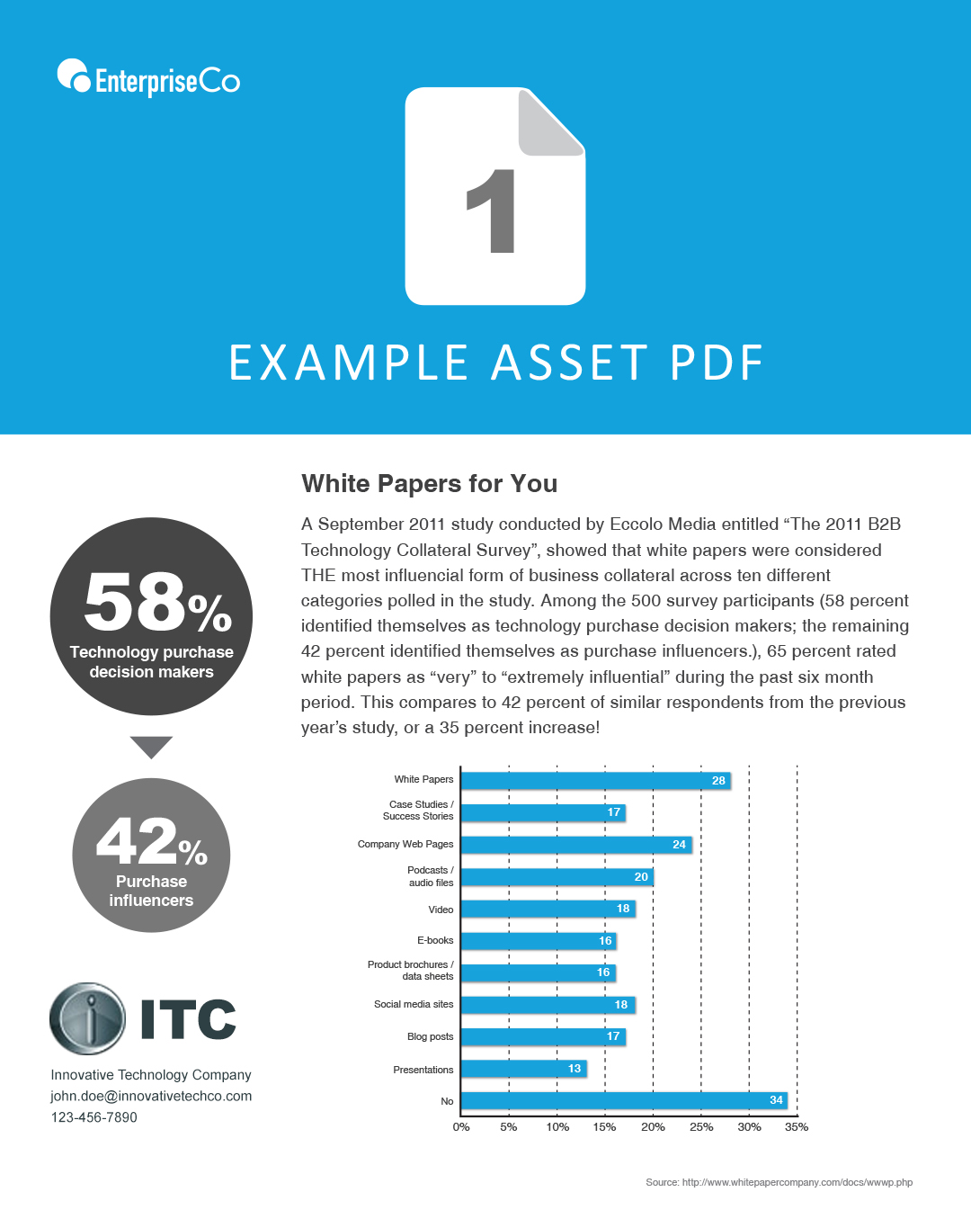
In this example, the cobranded section sometimes fits nicely into the sidebar area. However consideration must be taken for names and email addresses that maybe too big for the field area.

Here is an example where a long email address will cut off as it does not have enough room to expand.

 Bad positioning
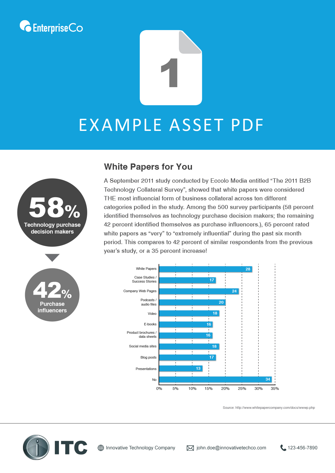
Setting the fields side by side is highly NOT recommended, as varying lengths of names and email addresses could cause copy to cut off or create uneven spaces between the fields

In this example, you can see how different character lengths and can either have too much or little room.

Partner logos should also be placed on a white background only. Not only could it be against any partner branding guidelines for logos to be placed on colors or images, but colors could clash or just visually look bad.
